COLOR THEORY IN KNITTING
As my years of experience in design and trend research have deepened, I’ve developed a strong interest in color theory and color development. I began to notice this influence extending into other areas of my life, including knitting.
The color palettes I chose for knitting projects often mirrored the hues I gravitated toward in my professional trend research and design work. Presented here are a few examples of how color theory emerges through my personal knitting projects.
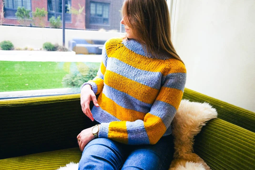
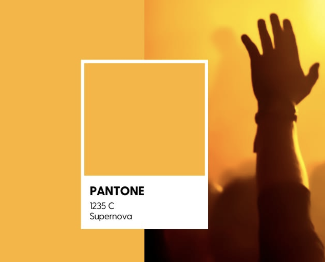
My most recent knitting project involved creating a striped sweater using multiple colors. Two colors from a recent palette at work—Pantone PMS 1235 C (Sunflower) and Pantone 284 C (Tranquil Blue) —caught my eye as an unusual yet striking pairing. I was able to easily select these colors in-store and instantly knew, despite their uniqueness, that they were a perfect match.


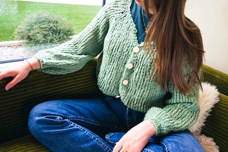
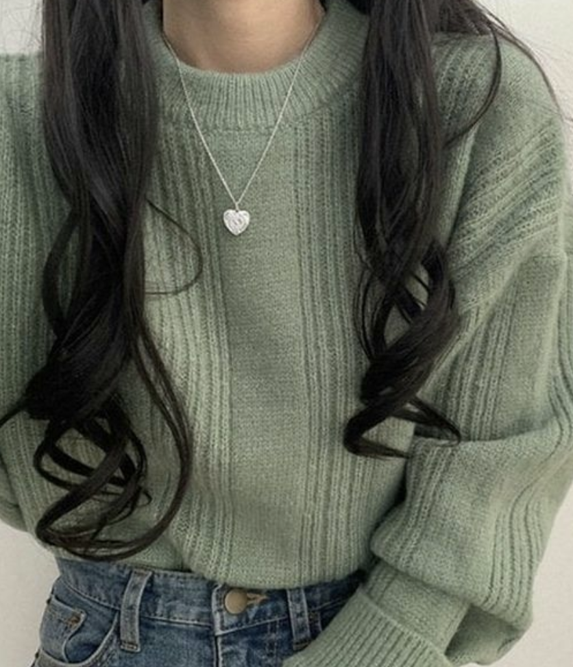
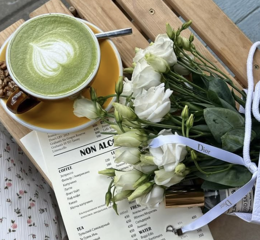
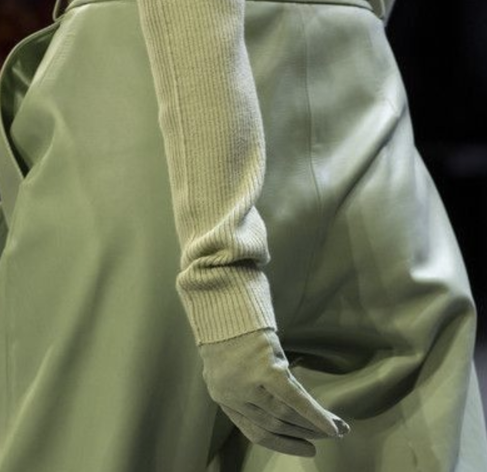
This matcha green color captivated me during color theory research for bag design (the original color was more lime - Pantone 13-0319 TCX) and I really gravitated towards it. I was initially disappointed that it wasn’t selected for any of my team’s designs, but I now wonder if that’s because it was better suited for apparel than for young adults’ school backpacks.
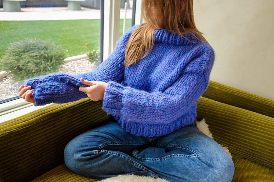
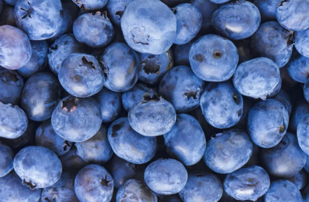
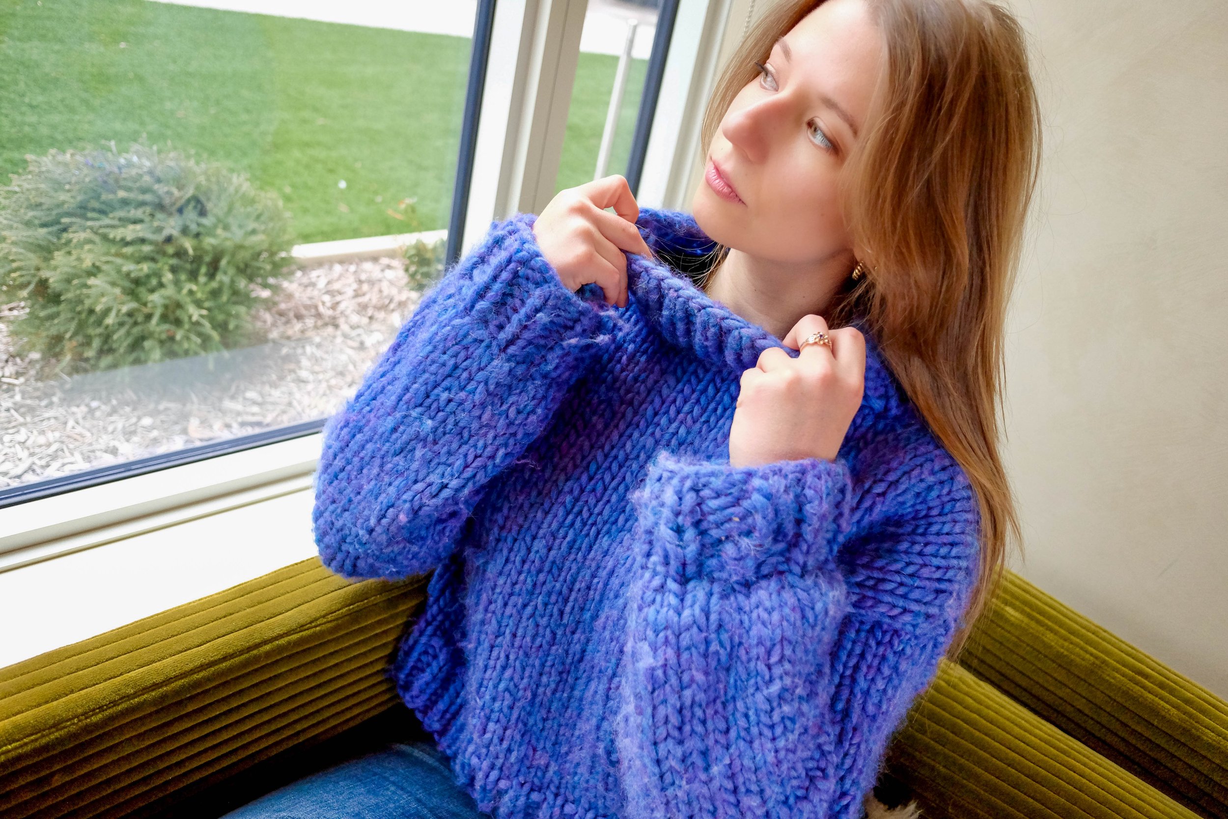
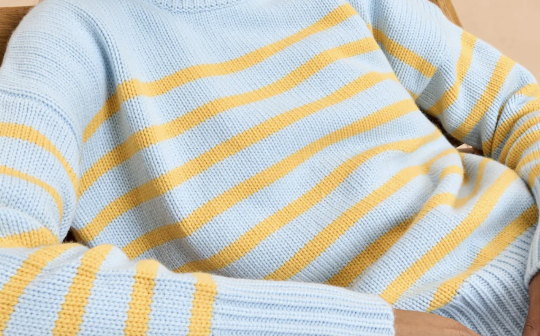
For the first sweater I completed, I spent a lot of time researching color options. Although this multicolored blueberry hue wasn’t part of a recent color palette in my professional work, it stood out during my exploration as an exceptional choice for a statement knit piece (and remains my favorite knit project so far).